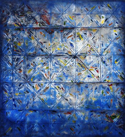
60 “ X 55” (153 cm X 140 cm)

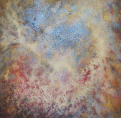
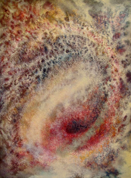


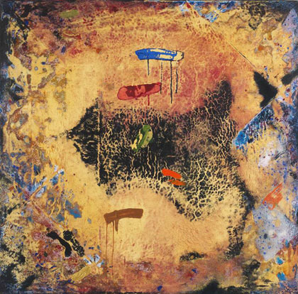


Marcie.wpengine.com/colors-create-fire-burn-up-paintings
by Marcie Cooperman
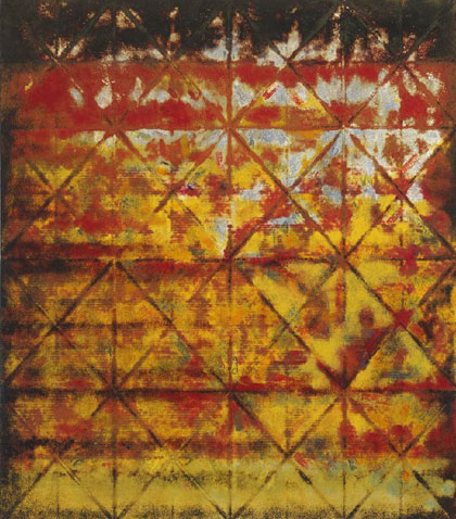
Fire engulfs the surface of Donald Spencer’s paintings. They are burning up, clearly being eaten away by fire and turned to charcoal, piece by piece. Yet still they are not destroyed. What makes these works so HOT HOT HOT? Color, of course.
Red and Gold Grid is being ripped to shreds by the intense flames created by a triad of hues: red/yellow/pale blue. We know them as the primary hues. Because of this relationship, they do act like a family. They go beyond their individual essence and work together to create their own world. But the way we see those hues is important in creating the heat and making the colors crackle and pop: several values of each hue are woven in and out of each other.
And we can imagine that there is actually something being ripped to shreds by fire: the grid on which the fiery shreds of color hang.
The grid provided a structure for placing the paint, and a way for Donald to check out the balance. He says: An important objective was to make each painted area of the canvas a composition that could stand on its own. Conversely, I wanted the visual DNA of any small section to be pervasive throughout the painting.

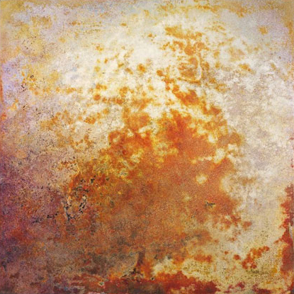
What does that grid do? More than you think. To see the difference it makes, check out Resonance Series #2, which has no grid. It is also on fire, but this fire swarms and billows up, a corroding presence that has gone beyond crackling and creating charcoal – it has destroyed any visible structure. Without the grid, the fire creates its own movement.
You can feel how different colors have their own types of energy! The reds at the top right are heavy, as red tends to be, and so the top feels like it is curving around to fall down. And the way the reds and yellows alternate throughout the painting makes fingers of fire pulse and writhe.

Because of its less saturated colors, Copper Grid is not on fire. It could be seen as the grid disintegrating through natural decay, with bits of sky showing through, if we want to see a story here. What is the color relationship we see? The complementary hues orange and blue (and also bits of the complementary red and green). Because there are several values of the cloudy low intensity colors, the colors deepen and soften the complementary relationship in Copper Grid.
Complements are famous for strengthening each other because each makes the other as different from itself as possible. This is an amazing relationship that is fun to play with, and the experiments could last a lifetime.

Blue Grid uses different proportions of the red/yellow/blue triad to produce icy cold slippery surfaces, with helpings of white and gray. Blue Grid uses mostly the blue, as opposed to the fiery reds and yellows. We see tiny red and yellow slashes sparkling evenly throughout the grid. The various values of blue force the whites to reflect and diffract forms that seem to be nearby. It’s glass, or ice, or metal. Blue is indeed cold, just like we have heard it is.

In Labyrinth, again we see red, yellow and blue, but with shots of other hues and lots of very high, and very low, values woven throughout. Labyrinth also eliminates the grid, replaced by curvilinear lines that are created with the French curve drafting tool. So, here we see intense movement, but of a primal, ethereal primordial soup type: emerging organisms, boiling atoms, birthing stars, in the vastness of space. That’s what curvilinear lines do, so different from the structure of a grid!
How does Donald create these intricate colors? He says: While sculptors free images by removing extraneous material, painters have traditionally built images by adding and manipulating the painting medium. My approach to painting is somewhat unorthodox in that it usually involves both the subtraction of material almost as much as the addition. Most of my recent paintings weave materials together in ways that build a subtle surface topography. This uneven surface may then be added to, or subtracted from, in selected areas and the process can be repeated many times to create interlaced strata of opaque, translucent and transparent paint.
On a few occasions I have used fine sand mixed with acrylic medium, but most often I prefer using fine marble dust with clear or pigmented acrylic resin. These materials may then be applied to the canvas many different ways. After the acrylic resin fully dries, about 3-7 days, I might choose to burnish parts of the painting surface to build deep luster and translucency. Sometimes I also use ultra-fine sandpaper that was engineered to polish things like telescope lenses. These painting methods enable me to thin the surface paint and produce subtleties of transitioning color and image that are not possible using a brush, or even airbrush.
Color, line, proportion, location of color – all are important in creating the types of movement and energy we have seen in these paintings. Donald Spencer has spent a lifetime exploring the possibilities, and he has come up with the key to life – energy.